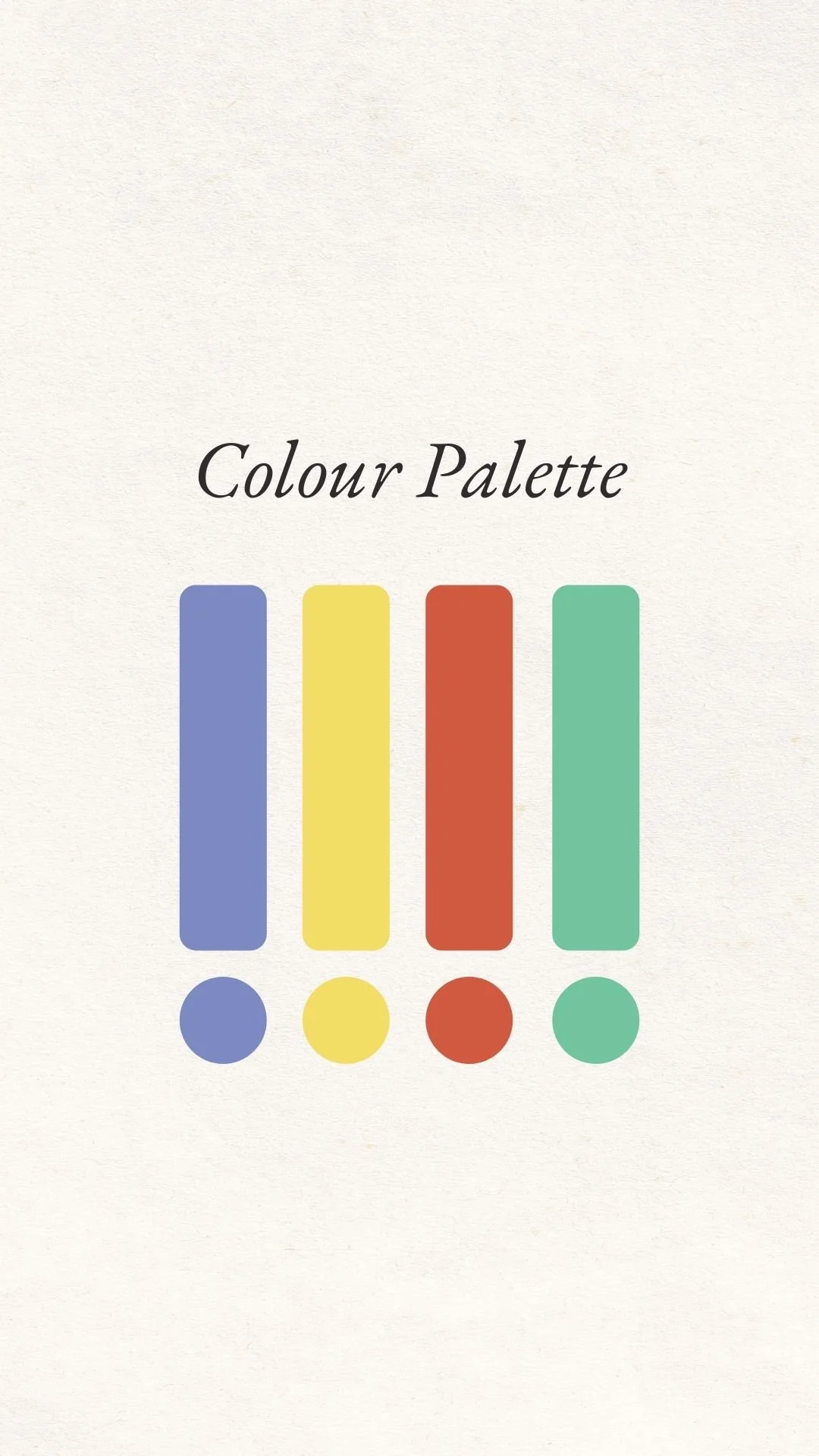

A colour palette
In this exercise, we are going to pull together your chosen colours into a palette that will begin to tell the “colour story” of your brand.
A colour palette is a collection of (say three or four) colours that are frequently used in your brand. They are colours that you’ll try to weave into your instagram photographs, into website imagery and into designs or illustrations that you commission.
They don’t need to be the only colours you use, and you don’t need to use all the colours in your palette in every picture you share.
But if you make it your goal to include at least one of your palette colours in all of your photography, and if you respect the general tone and saturation of your palette, then your brand will be on the way to telling a consistent story.
It’s also important to note that having a brand colour-palette doesn’t necessarily apply to the products you create. For example, if you’re a potter, an artist, or a basket-weaver, your cups and bowls, paintings and baskets don’t need to be restricted to the colours in your palette. Instead, your palette will be the backdrop to your products, the gallery walls, so to speak. Your palette will show up in the photographs on your social media, your blog posts, your product packaging, the notecards you create, the covers on your e-books, your website… you get the picture!
You know the brown and tan that we all instantly recognise as being Louis Vuitton? Those are that brand’s colours, and it doesn’t matter what colours are in this season’s designs, the Louis Vuitton colour palette is still recognisable and memorable as tan and brown.

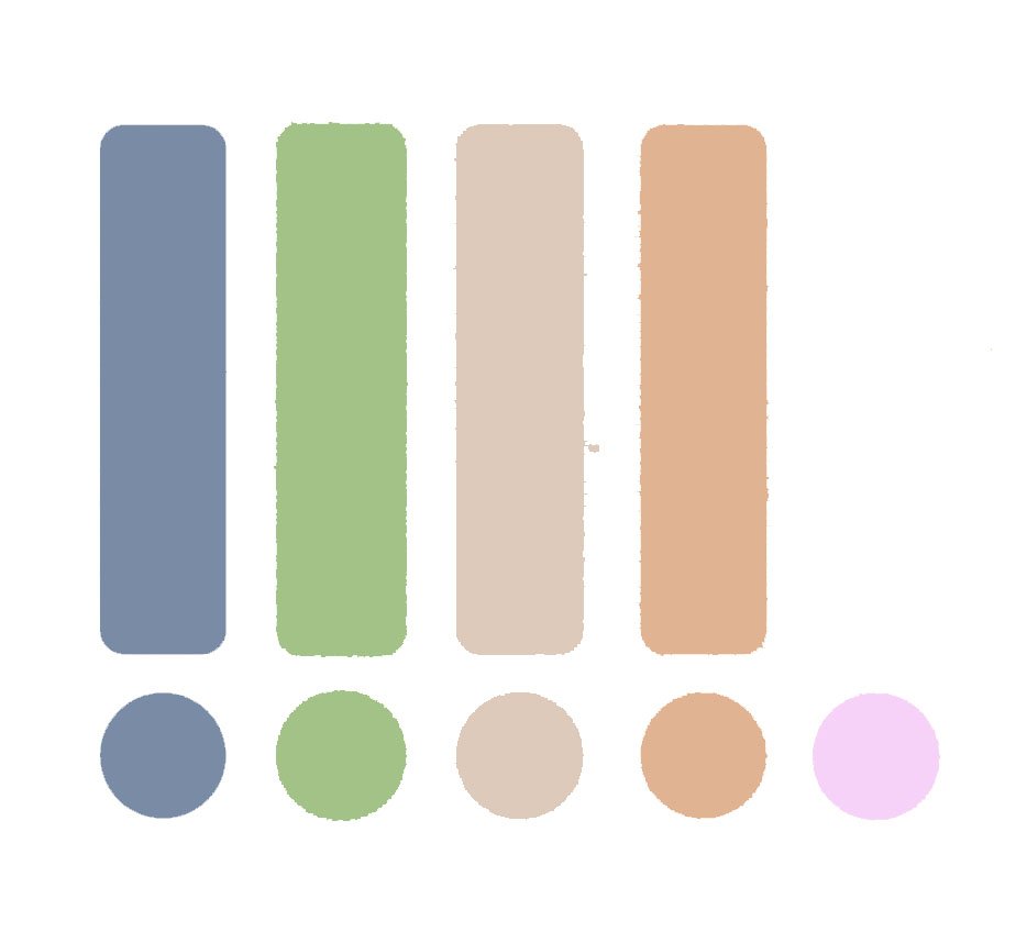
This is a screen-grab of my Instagram feed. My brand colours are green, greyish-blue, sand, and apricot or pink. Can you find at least one of those colours in each of the images in my grid?
CREATING YOUR COLOUR PALETTE
Okay! Now I’m going to invite you to create a basic colour palette, It will be comprised of two complementary colours (those that are side by side on the colour wheel) and one accent colour (one that’s opposite the other two on the colour wheel). And if that’s not enough for you, we’ll build from there.
The colour wheel:

Workbook instructions
-
1. Look for repetition
Turn to page 30 of your notebook. Looking over all the colour-lists you made yesterday, note down any that appear more than once, in the first box.
-
2. Note your preferences
Of the colours you’ve noted down in the first question, now choose your favourites. Aim for two favourites (you can always add to them later).
-
3. Choose a third
Take a look at the colour wheel above. Are the two colours you have chosen next to each other (or sort of next to each other) on that wheel? Then choose something opposite on the wheel that you like. Are your two colours opposite each other? Then choose a third colour that sits next to one of them.
-
4. Find the hex codes
You might want to play around with the colours at this point. Are you liking how they work together? Good! If not, go back to Step 1 and choose some alternatives.
Now on page 31, note down the Hex colour of each of your choices. You can look them up here if you need to, and play around to get exactly the right tone for each colour you choose.
-
5. Note down extras
Do you feel you need more colours to balance out your palette? Note them in the box at the bottom of page 31.
If you need extra help…
A PRACTICE CHALLENGE
Sometimes it’s easier to understand how colours fit in with brands when we are thinking about somebody else’s brand. Preconceived ideas and personal taste don’t get in the way.
Below are four brands, each with their three mood-words. Underneath, I’ve shared four colour palettes that match the brands. However, they are not in the right order. Can you match the brand to the colour palette, by thinking about the emotions their mood-words convey?
(If you want the answers, you’ll have to ask me in a workshop or in our group - right now, I just want to challenge you to think in this way so it doesn’t overly matter what the “correct” answers might be 😉)
Still struggling with your own colours? Take the survey at the bottom of the Lesson 4 page to see if it provides you with any insights.
-
A photographer
adventurous
storyteller
inspirational
-
A nutritionist
harmony
growth
balance
-
A recipe writer
empowering
creative
connected
-
A farmer
healthy
natural
homegrown